Amazon EHS


Research
I began by thoroughly analyzing the existing Environment Health and Safety (EHS) Wiki page and its related communication assets. This involved reviewing trouble tickets to identify common user pain points and understanding the global audience's needs. I also gathered feedback from program managers to align the redesign with their expectations and Amazon's brand identity.
Sketching
With the insights from my research, I sketched out initial concepts for the page layout, navigation structure, and visual elements. These sketches focused on creating a cohesive and accessible design that would work across different platforms and regions.
Digital Design
After reviewing the sketches with key stakeholders, I translated the chosen concepts into digital designs using tools like Adobe Illustrator and Figma. I developed a new set of icons, illustrations, and color schemes that aligned with Amazon’s branding while reinforcing the educational and friendly tone required for the EHS page.
Refinement
I refined the digital designs based on stakeholder feedback, making adjustments to ensure the visuals were consistent, scalable, and accessible for a global audience. This stage involved testing the design across different devices and platforms to ensure it functioned smoothly and met user needs.
Finalization
Once the designs were finalized, I implemented them across the EHS Wiki page and related communication materials. I also provided guidelines for future updates to maintain consistency in the brand identity.
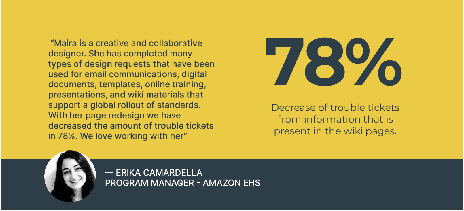
The redesigned EHS Wiki page significantly reduced the number of trouble tickets, as users found it easier to navigate and access the information they needed. The new cohesive brand identity was well-received by stakeholders and employees alike, establishing a unified global presence for the EHS team.
By conducting thorough research, collaborating closely with stakeholders, and focusing on user experience, I successfully redesigned the EHS Wiki page to meet Amazon's global needs. The project not only enhanced the page’s visual appeal but also improved its functionality, ultimately supporting a more efficient and user-friendly experience for employees worldwide.
Design Process
I was tasked with redesigning the Amazon Environment Health and Safety (EHS) Wiki page for a global launch. The request was broad: make it look "fresh" and easier to navigate. The existing communication assets lacked cohesive design and consistency across global locations, leading to confusion and an overwhelming number of trouble tickets for information that was already available.


Inconsistent Design: The EHS page and related communication assets were visually inconsistent across different platforms and regions.
Outdated Navigation: The navigation structure was outdated, making it difficult for users to find information, resulting in a high volume of trouble tickets.
Cohesive Brand Identity: I developed a clear and cohesive brand identity for EHS, including a refined color palette and a new set of icons and illustrations that aligned with Amazon’s brand while reinforcing an educational and friendly tone.
Global Accessibility: I designed visuals and content that were easily translatable and culturally neutral, ensuring accessibility and understanding across all regions. This included posters with minimal text, universal symbols, and content adjustments based on regional preferences.


ANALYZING TROUBLE-TICKETS
At least half of the tickets could have been resolved if the requester knew the areas that EHS covered in their region.
Conceptualize/Build Prototype
Direction 1 - Leadership wanted to keep a side menu
Direction 2 - Funnel down from regions with big CTAs


The redesign significantly reduced the number of trouble tickets by making the navigation more intuitive and consistent. The clear and cohesive brand identity I established for EHS was praised by stakeholders for its scalability and effectiveness in creating a unified global presence.


thank you